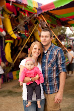
I was just feeling creative today and wanted to work on creating more fine art shots. This is a super crop of an older image of mine. What do you think?
Still waiting on my letter from Hogwarts
 I call this one, "Get that camera out of my face and feed me!" The only time she smiled was when my sister would give her a pretzel. This is my down syndrome niece by the way. Oh, it's cross processed too(I'm sure you could tell.)


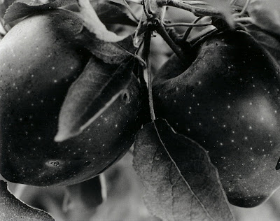 1. This is actually one of my favorite images. This was for one of my first assignments in Photo 1, back when I had no clue how to use a camera. We were supposed to learn how to use filters in the darkroom to help our prints. I remember when I used a #5 filter on this picture, and Gerald simply remarked, "That's a cool image." I was like, "Oh mylanta! One of the photo gods has spoken to me, and he said my picture was cool! My life is complete." I really enjoy the textures, tones, simplicity, and focus of this image.
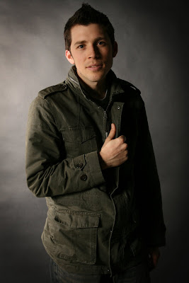 2. This image was from my first shoot in the studio. I was super nervous the night before because I'd never set up any of the equipment by myself. But low and behold, I'm not an idiot and was able to make some pretty decent portraits. Portrait photography is something I'm extremely interested in pursuing so finally being able to produce images that I wouldn't be embarrassed to give to a potential client was very rewarding. This may sound silly to some, but I feel very grateful to be able to learn about photographic lighting.
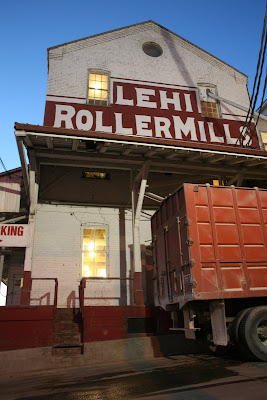 3. This is the Lehi Roller Mills, obviously. I was asked to take a picture at twilight with two light sources with the same exposure. I sat outside for about 30 minutes to take this. I waited and waited for the exposures to match thinking they never would, and that I was doing the assignment wrong. Then all of a sudden the exposures matched. I was in shock. The image turned out exactly how I wanted it to, which is not congruent with my track record. I'm glad I learned this trick in making a run down building look interesting and alive.
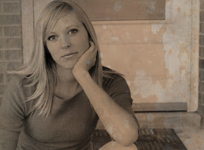 4. In this instance, I learned how to add textures to an image using Photoshop. I liked this image already, but I think the texture adds some grittiness to it. I'm glad that I learned how to add textures to my images because I think it can really enhance what you, as an artist, are trying to portray.

